"Gofresh: Crafting an Intuitive,
Fresh-Food Delivery Experience"

GOFRESH: A Modern Approach to Fresh Food Delivery
how it started

THE BACKSTORY

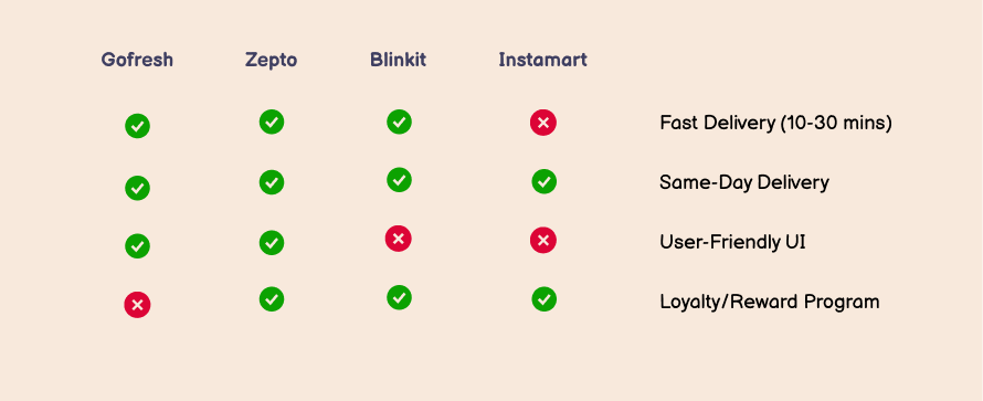
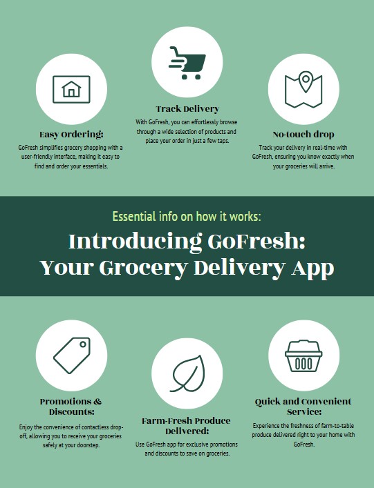
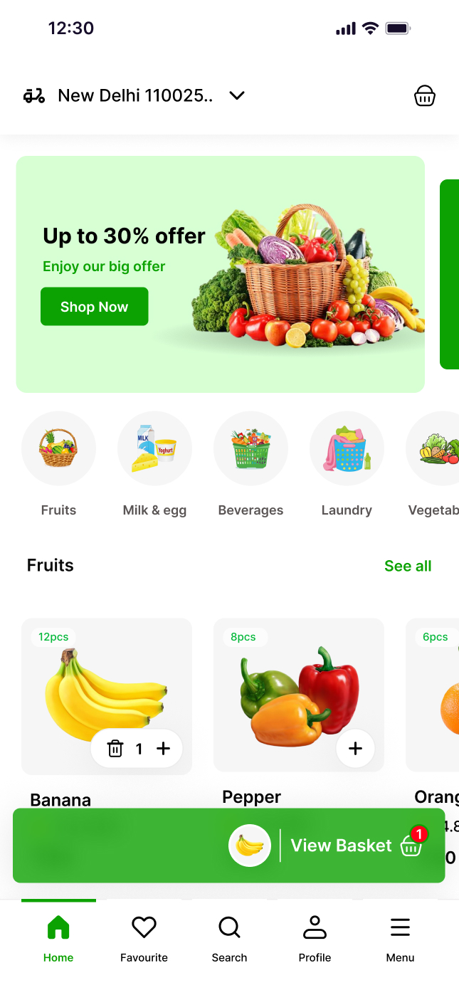
The idea for Gofresh stemmed from a growing demand for quick, convenient access to fresh groceries in today’s busy world.


Gofresh was created to solve this problem by offering a fresh, user-centric design that streamlined the grocery shopping process. The goal was simple: provide a seamless, enjoyable experience for customers looking to buy fresh produce, groceries, and everyday essentials from the comfort of their homes.

TOOLS USED

"100% of Gofresh deliveries use recyclable, sustainable packaging to reduce environmental impact."

"85% of Gofresh orders are delivered within 30 minutes, ensuring fresh produce right to your doorstep."

Orders during off-peak hours (10 AM to 2 PM) are delivered 15% faster on average.

mind maps & market research

The Client Challenge

The client may struggle to validate whether there is strong demand for a new grocery delivery app in an already competitive market.

I spent this phase doing market research, and gap discovery of the products similar to product.

After conducting thorough market research, I found that current competing grocery delivery apps lack key features in four areas: quick delivery, native mobile app usability, seamless payment options, and personalized recommendations.

competitive analysis

Mind Mapping is a technique I used in the ideation phase to visualize the core features and user flow for Gofresh. This gave me a clear overview of the application’s architecture and user experience without cognitive overload.

How it works

user research

The UX Process

This was a full-scope research and design project. I conducted comprehensive discovery and research including competitive analysis, interviewing and surveying users, empathy mapping, and feature prioritization.

The key takeaway is that valuable knowledge on how to prevent bike theft is scattered online and not readily available to all cyclists. This lack of awareness leaves them vulnerable:


- Customers don't know how to check if a product is out of stock
- They're unsure how to track their order status
- They lack clarity on delivery time estimates
- Users don't know where to find special offers or discounts

Where research & design intersect

Iterate & Conquer

I use a "start loose, finish tight" approach when it comes to design iteration with Sprocket. I also brainstorm in, mind maps, outlines before diving into any design software, or sketching layouts on my iPad before any high-fidelity mockups.

This initial looseness lets me explore freely, change direction easily, and avoid tunnel vision. I also find that sketching is also a low consequence avenue for exploration.

After ideation, I let user testing, both un-moderated&moderated, informed my final design choices, based on user feedback.

design evolution through iteration

real problems require real solutions

The Solution

I helped turn the client’s vision, a comprehensive, navigable mobile theft and mitigation platform, into a reality. The end result provided a simple, unique solution for the client.


We expected 1,500 registrations and signups in the first 3 months and received double that.


We predict that getting buy-in from universities, police departments, and bike retailers helped Sprocket signup and adoption rates.

High Fidelity screens

plans are great, until they change

Challenges

project challenges

Midway through designing the GoFresh product page, we identified a crucial product categorization section missing from the design, requiring significant revisions across multiple screens.

New LEARNING

Midway through designing the GoFresh app, we discovered missing features for delivery time filters and user preferences, requiring major adjustments across the design and data model. This led to changes in the product categorization, checkout process, and UI elements across multiple screens.